Howton Grove Priory | Mobile WebsiteSharing a Vocation with the World . . .
In Praise of Caxton
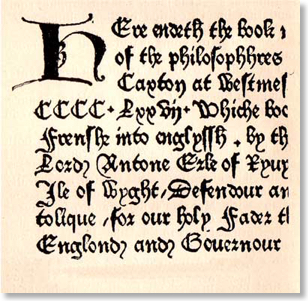
On this day in 1477 William Caxton issued the first book in English actually printed in England, or so we believe. It was Dictes or Sayengis of the Philosophres (Sayings of the Philosophers) translated from the French by Anthony Rivers, second Earl Rivers, a learned man and brother-in-law of Edward IV, beheaded in 1483 by the future Richard III. The colophon (detail illustrated above) is fascinating. It shows type trying to look like handwriting but with some ugly word spacing and contrasting weights of letter-forms. Having said that, the page is remarkably evenly inked, while the use of punctuation (a Cistercian innovation of some centuries earlier) makes the text easy to read. No wonder many in Westminster were deeply worried about this new technology. It was to have a great future. You wouldn't be reading this if it hadn't.
One of the developments of Web 2.0 we particularly welcome here at Hendred is the renewed interest in typography, specifically typography for onscreen use. Our current site is typographically merely "functional" but there are many examples of really beautiful work on the web which is quietly raising standards. Sadly, many people are happy to stick to Arial (probably the worst typeface ever designed in our unprejudiced view) or Times (an excellent typeface, but over-used) or "don't see what all the fuss is about". It is the latter which sends Digitalnun into despondency. If you want to know why, read Beatrice Warde's little gem on the importance of typography, The Crystal Goblet. It will open your eyes.
Nov 2010
Oct 2010
Sep 2010
Aug 2010
Jul 2010
Jun 2010
May 2010
Apr 2010
Mar 2010
Feb 2010
Jan 2010
Dec 2009
Nov 2009
Oct 2009
Sep 2009
Aug 2009
Jul 2009
Jun 2009
May 2009
Apr 2009
Mar 2009
Feb 2009
Jan 2009
Dec 2008
Nov 2008
Oct 2008
Sep 2008
Aug 2008
Jul 2008
Jun 2008
May 2008
Apr 2008
Mar 2008
Feb 2008
Jan 2008
Dec 2007
Nov 2007
Oct 2007
Sep 2007
Aug 2007
Jul 2007
Jun 2007